Order Total(Inclusive of VAT)


.webp)
Walk into any hotel suite that has been designed with real intention and notice what you feel before you notice what you see. There is usually a particular quality of calm — a room that does not ask too much of you. The palette is quiet. The surfaces are composed. The furniture sits with a kind of confidence that does not require you to look at any one thing too long. This is the work of neutral interior design, and it is far more sophisticated than it first appears.
Neutrals have had a complicated relationship with reputation. For years, they were dismissed as the safe choice, the default of the indecisive. What the design world has come to understand, and what the most accomplished interiors consistently demonstrate, is that working with a neutral color palette at home is one of the most demanding things a designer can do. There is nowhere to hide. Every proportion, every texture, every tonal relationship is fully exposed. When it works, it is nothing short of extraordinary.
Why neutrals and the mind
There is a psychological dimension to this that is worth taking seriously. Research into environmental psychology consistently finds that colour saturation and visual complexity are processed as stimuli by the brain. A busy, bright room keeps the nervous system engaged and mildly elevated. A room built on calming interior design ideas — soft whites, warm linens, gentle stone tones — signals safety and ease. The body quite literally settles. In a world of screens, noise and constant information, coming home to a neutral space is not a decorating preference; it is a form of recovery.
This is part of why luxury minimalist homes are not just a trend but a sustained and growing commitment in high-end design. The investment is in quality of feeling, not quantity of visual information.
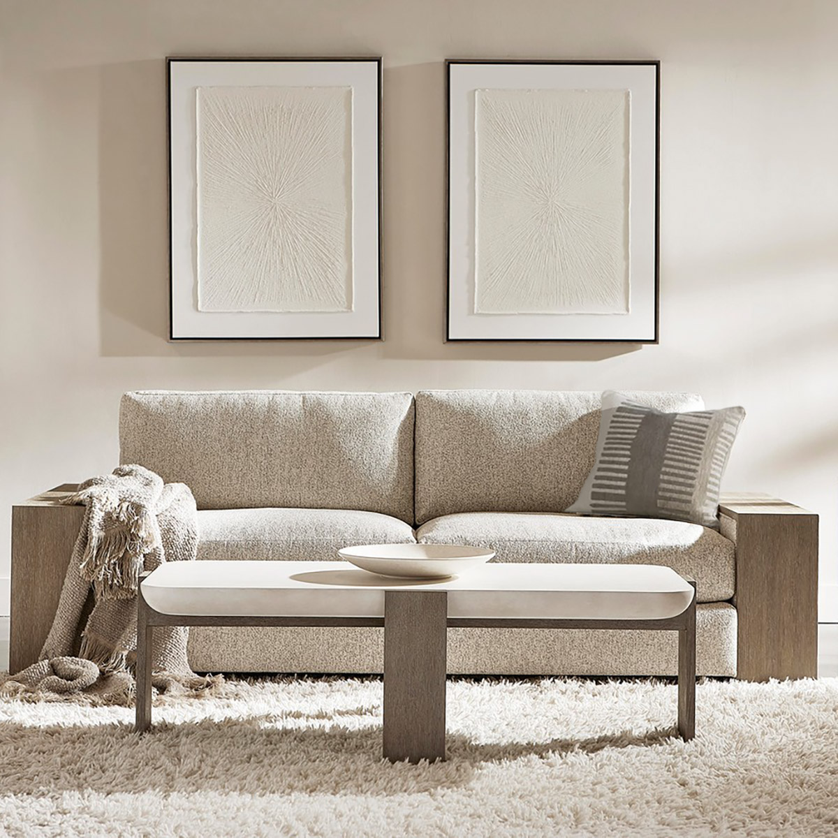
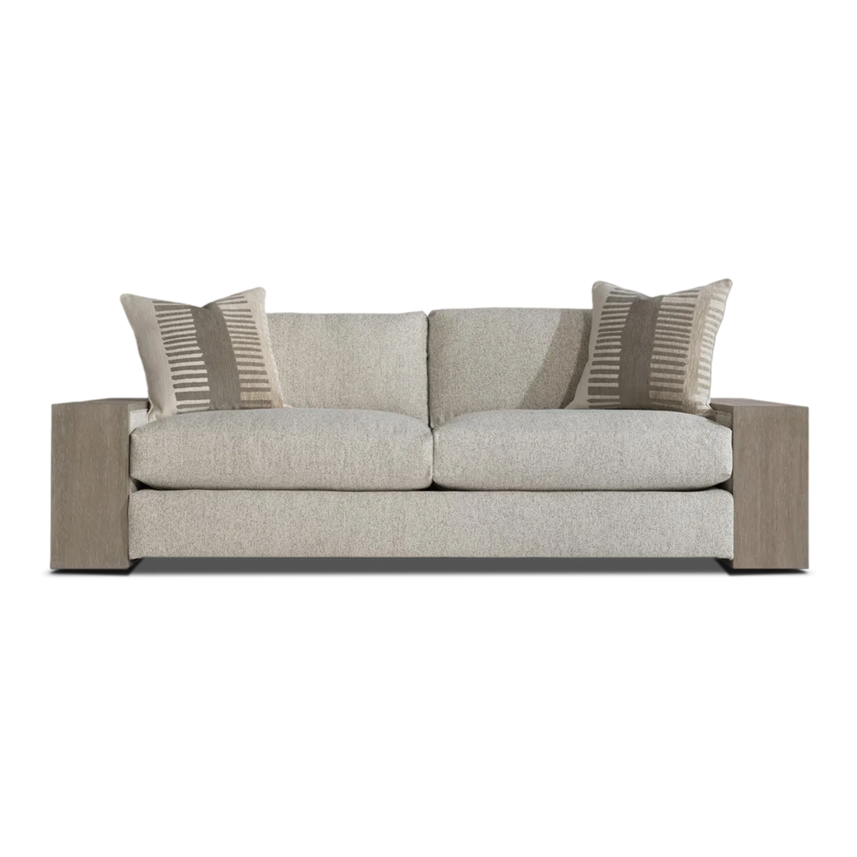
The living room: where neutrals earn their place
The living room is where neutral interior design faces its most rigorous test. It must accommodate many moods, many kinds of light and many kinds of use — all while maintaining its composure.
The Bernhardt Kali sofa meets that test with a design that rewards close attention. Structural arms of exposed wood in a Flint finish frame, inset with upholstered panels on either side, with box-edge bordered cushions floating between them. This interplay of warm wood and fabric is precisely the kind of tonal layering that makes modern neutral home décor feel rich rather than bland. The piece has visual architecture without visual noise. In a neutral living room, it does not merely sit; it anchors.
The Bernhardt Isabella fabric sofa takes a different approach to the same philosophy. European in its low seating profile and generous scale, it combines rolled arms with exposed wood legs and deep feather-down cushions in cream or grey tones that are the very definition of beige and white interiors at their most effortlessly considered. The relaxed tailoring and soothing neutral colour palette are not accidental; this is a sofa that understands that a great neutral piece should feel as calm as it looks.
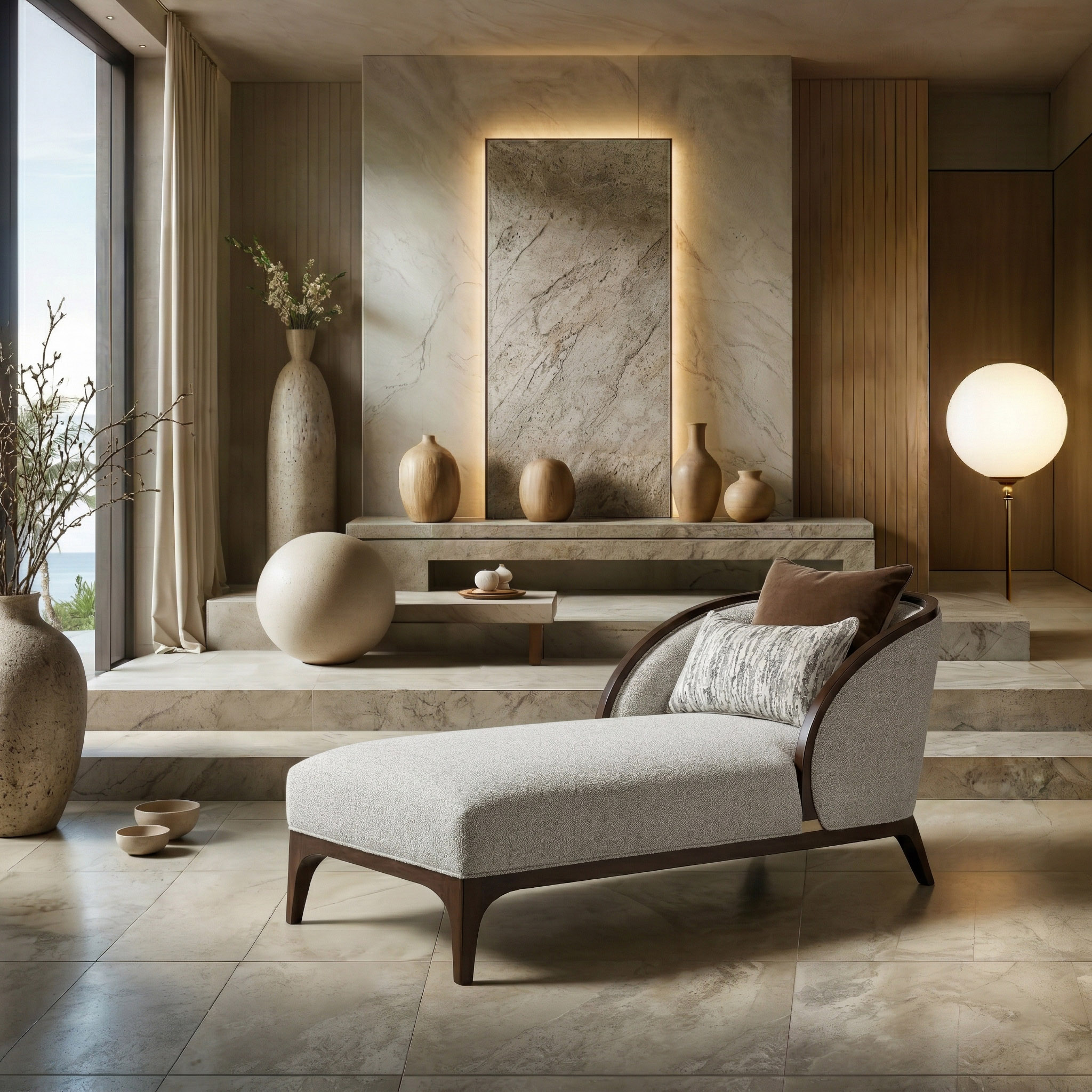
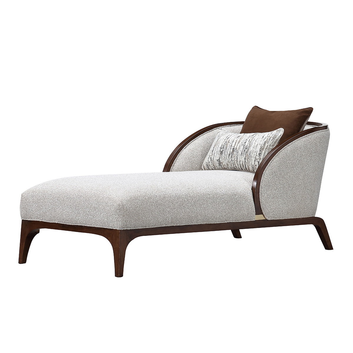
The accent chair as punctuation
In any well-considered neutral room, the accent chair functions as punctuation. It does not compete with the sofa; it completes the sentence. The Bernhardt Cleo swivel armchair does this with particular intelligence. Its half-circle sweep from back to arms, cradling a generous deep seat, upholstered in richly textured nubby fabric in neutral tones, brings tactile depth without tonal disruption. The 360-degree swivel base adds practical ease — and in a neutral living room, where the furniture must carry the full aesthetic weight, a chair that moves and adapts is one that earns its keep every day. This is contemporary neutral décor that understands function and form as inseparable.
The bedroom: neutrals at their most powerful
If the living room is where luxury neutral décor performs, the bedroom is where it heals. Sleep research details that the environment we sleep in directly influences the quality of rest we experience. Visual noise before sleep keeps the brain alert; quiet, tonal spaces allow the nervous system to wind down.
The Malibu Crest king bedroom set by Michael Amini understands this completely. Its Cloud White upholstery with Chardonnay finished woodwork and intricate carved details creates a bedroom that reads as warm, composed and deeply considered. The palette belongs to the broader language of neutral interior design — creams and soft whites layered against warm wood tones. The velvet-lined drawers, the scalloped bed frame details and the understated metalwork accents are the kinds of hidden qualities that make this a set you continue to discover over time. In the context of neutral living room ideas more broadly, it demonstrates the principle that neutrals are most compelling when they are not flat but textured, not simple but layered.
The logic of the neutral home
A neutral colour palette at home is not a retreat from personality. It is a very specific expression of it — one that prioritises longevity over novelty, calm over stimulation and quality of material over quantity of colour. The rooms that achieve this most successfully are the ones that reward time spent in them. They are rooms that feel better the longer you know them.
Featured collection
YOU MAY ALSO BE INTERESTED IN
YOU MAY ALSO BE INTERESTED IN